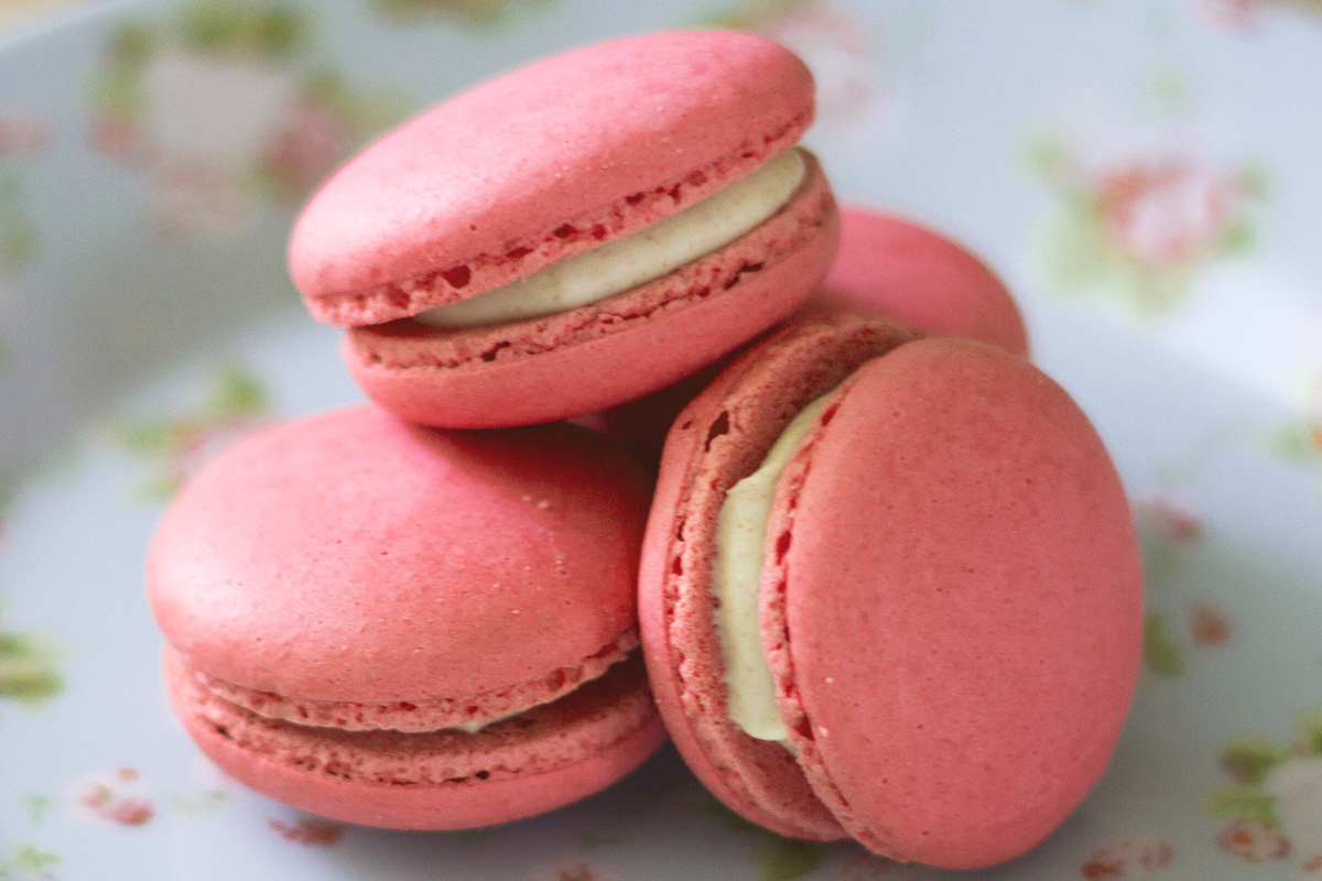
Every winter since the year 2000 Pantone, the company behind one of the widest used standardized print colour-matching systems in the world, announces its “colour of the year”. The choice of the coming year’s “on-trend” colour seems somewhat arbitrary, but according to the Pantone Colour Institute is based upon the collective decision of a number of colour experts who analyse colour influences from fields such as film, art, design, nature, technology, sport and fashion. It’s also a somewhat commercial endeavour, with the colour selection being available to purchase ahead of the general announcement by companies who can then build and release products that capitalise on the coming colour trend. We aren’t one of those companies; if we produce a piece of furniture featuring Pantone’s colour of the year it is only because a customer has requested that tone.
2019’s colour of the moment is called Living Coral (aka Pantone 16-1546) and has been described by the company as “buoyant, vibrant and effervescent”. Inspired largely by the natural world, it’s a coral pink hue, almost verging on orange, with a golden undertone.
“Colour is an equalising lens through which we experience our natural and digital realities and this is particularly true for Living Coral. With consumers craving human interaction and social connection, the humanising and heartening qualities displayed by the convivial PANTONE Living Coral hit a responsive chord.”
We’ve produced several pieces with steel in various shades of pink not dissimilar to Living Coral over the past few months, from a set of hairpin leg bar stools to the floating shelf units for a coffee kiosk fit-out. The pink tones of the steel work really well with oak and the pale birch face of our plywood option. If you’re interested in ordering an item of furniture in a pink or Living Coral colourway then drop us a line, and we’ll advise on the best RAL paint code to go for (Pantone is predominantly used as a colour matching system in the print industry, whereas the system used for powdercoat colours is RAL).


