

In December, Pantone announced it’s Colour of the Year for 2020: Classic Blue, aka Pantone 19-4052.

Pantone is the company behind one of the widest used standardized print colour-matching systems in the world; originally a printing company founded in New York in the 1950s (Pantone is now based in Carlstadt, New Jersey), in 1963 the company launched the Pantone Matching System that became the foremost method of accurately matching and reproducing colours across a variety of industries, so that the colour that appear on your printed material or packaging is the same as the colour that you signed off on the design.
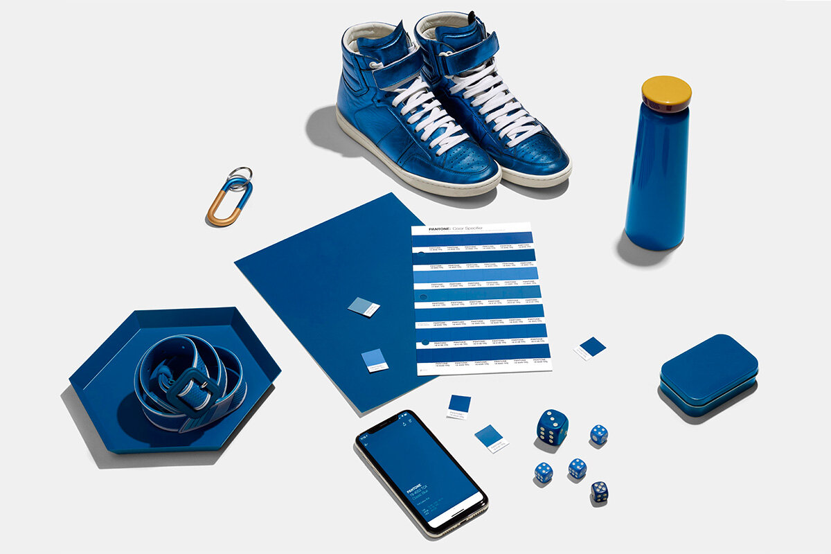
The first Colour of The Year was published in December 1999, with 2000’s colour being Cerulean, another blue hue. Pantone described Classic Blue as "a reassuring presence instilling calm, confidence and connection". After some of the negative press that 2019’s colour “Living Coral” received (because much of the world’s coral reefs are under threat and many are bleaching), Classic Blue is seen as the company choosing a much safer option this year, reflective of the uncertainty being felt around the world at the turn of the decade.
“Blue, from an emotional, psychological standpoint, has always represented a certain amount of calm and dependability. It’s a color that you can rely on.”
- Leatrice Eiseman, Executive Director, Pantone Color Institute
Classic Blue is supposed to be genderless, seasonless, and accessible to all, reminiscent as it is of the sky at dusk.
“We’re returning to classics because everything has been chaotic in the world,” Vice President of the Pantone Color Institute, Laurie Pressman, told TIME Magazine, “It’s not about doing it like you did in the past, but reinterpreting it.”
Pantone Color Institute recommend using Classic Blue as an accent colour; in fashion by choosing a Classic Blue scarf or watch strap, and in interior design and décor by featuring Classic Blue accessories. We’ve never been a company that will prospect based on industry predictions (and we’re certainly not one of the companies that pays a premium to be told the colour of the year ahead of its announcement, to get a head start on implementing it into products), so we’ve only produced furniture featuring deep or “Classic” blue in the past when a customer has ordered it. We have made a set of ModSys brackets in Classic Blue in the past, and the subtlety of the blue leg brackets paired really well with the pale tones of the birch plywood.

If you’re interested in ordering an item of furniture featuring Classic Blue, then get in touch so that we can advise on the best Pantone equivalent RAL paint code to go for (because powdercoating steel uses a different colour matching system). Whether you are considering an item from our ModSys range or you want to feature Classic Blue a bit more front and centre, with bold blue legs on a Nola dining set, every option is available to you. And if you like to always be at the cutting edge of colour trends then, when Pantone announce their colour of 2021 in 11 months time, you can give us a call and we can discuss re-colouring all of the steel elements of your Cord furniture. Colour doesn’t have to be forever, but your furniture can be.
